 This is a long essay, full of historical detail about the exact colors Nolde used and the places he lived. I was trying to understand how he thought of color. It’s an old essay, but it has a number of details that are still not in the literature: I tracked down his exact pigments, a map of the town he was born, and several contemporanerous sources for color practices.
This essay is still unpublished, and not available elsewhere.
Here is the opening of the essay:
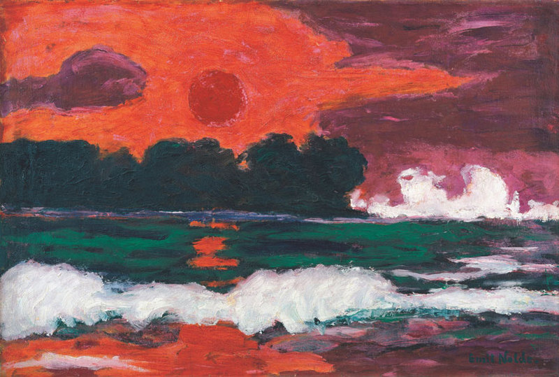
Tropensonne (Tropical Sun) was painted shortly after March, 1914 in a most obscure part of the world: the outpost of Käwieng in Neu-Mecklenburg (now New Ireland). Aside from its location, which is certainly more exotic than Gauguin’s Tahiti, it seems the painting is fairly straightforward. Its subject matter is clear—once the viewer recognizes the distant shapes on the horizon as trees—and it has simple forms and few colors. There are in fact only six pigments: two warm, two cool, and black and white.
The red sky and sun are painted in Scharlachzinnober, our scarlet vermilion, and the darker sky is a wild, sultry madder, possibly violet Krapplach, which is close to our manganese violet. Opposed to them are a green and blue: the cold green is probably Malachitgrün (close to our “emerald green”), and the light blue under a breaking wave is helles Kobaltblau, modern cerulean blue. These four are alternated and mixed with a white, probably Zinkweiss, and Elfenbeinschwarz, ivory black.
Listing the colors like this brings out several things. First: the painting’s quality of natural simplicity is deceptive—its colors are two carefully picked pairs of strong pigments rather than the more common, greyer hues Nolde might have chosen if his intentions had been more simply naturalistic. Second: even though it is possible he was matching colors to what he saw, the eccentric and mechanical choice of pigments suggests that he was not. It is a difficult question to decide, since the sun is often red and the sea can be green. In this case Nolde provides at least a clue to the role of mimesis, since he recalls in his autobiography Mein Leben that he painted inside a converted police detention building at some distance from the sea, with his “powerful, rich colors” ranged around him (“mit den herrlichen reichen Farben um mich herum”). Most probably he did not even have a sketch of the scene in front of him. The colors have another odd quality: they are opaque and flat, so that the sun appears to be pasted onto a colored background, rather than floating in empty atmosphere. Paintings like Munch’s The Scream teach us that schematized forms and limited palettes do not entail a sacrifice of atmospheric qualities. Munch’s painting has a mixture of the colors of sunset—white, yellow, pink, red, and some blue—and together they reproduce both the painter’s signature undulating line and an equally familiar streaked cloudy translucence.
An oil underpainting aids this, showing through casein and pastel highlights, relieving flatness and suggesting a swirling atmosphere. Tropensonne’s sky on the other hand, has only two hues in opaque color areas, and what feeling of transparence there is has been achieved incidentally, by roughness of brishstrokes. Tropensonne’s sky is closer to what Constable called a “white sheet,” a backdrop without depth. A collaged sun is pasted to it, and it hangs there, without gravity and with no more power to illumine than a paper-patch sun has to shine on an Albers collage.
 .
.
James,
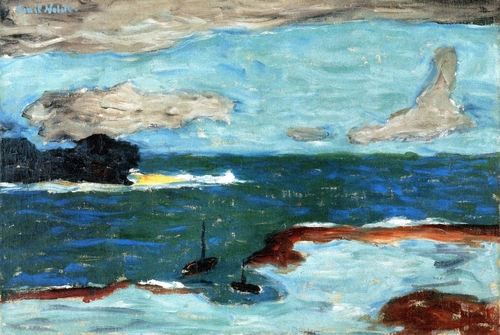
I see that you may know a lot about Emil Nolde. I think I may have an original oil painting of his but I am really very uncertain. I have photos I can send you or someone that may be an expert of his work. I bought it at an auction house about 7 years ago and was think of bringing to PBS antiques roadshow. I am an artist my self so I have been looking at the brush strokes and I think if it is his work it may have been done at Lake Lucerne in Switzerland as I know he been there painting and the seascape/landscape looks similar. His Autumn Sea Vll and Sea in Autumn also has a little resemblance. Although my painting is very sepia toned oil with a silver like paint stokes. Please email me back and I will send you photos.
Thanks, Cindy Jowers
Hi, sorry, I’m not an expert! Good luck: I’d try the Nolde Stiftung in Germany, http://www.nolde-stiftung.de/